Android Popup menu is really a good way to make your Android application more elegant and create a great UI. And we already discuss some menu library for Android application like ;
- Topbar Menu with Guillotine animation
- Amazing Side Menu Animation
- Cool Cards Menu Animation
- and you can see full list of menu library here.
Now let’s focus on PowerMenu Android library which is a library that let you implement Android popup menu so easily. Without going much more start with implementation.
Demo
Download Android popup menu library
Gradle
dependencies {
    compile 'com.github.skydoves:powermenu:1.0.8'
}
Usage
Basic example
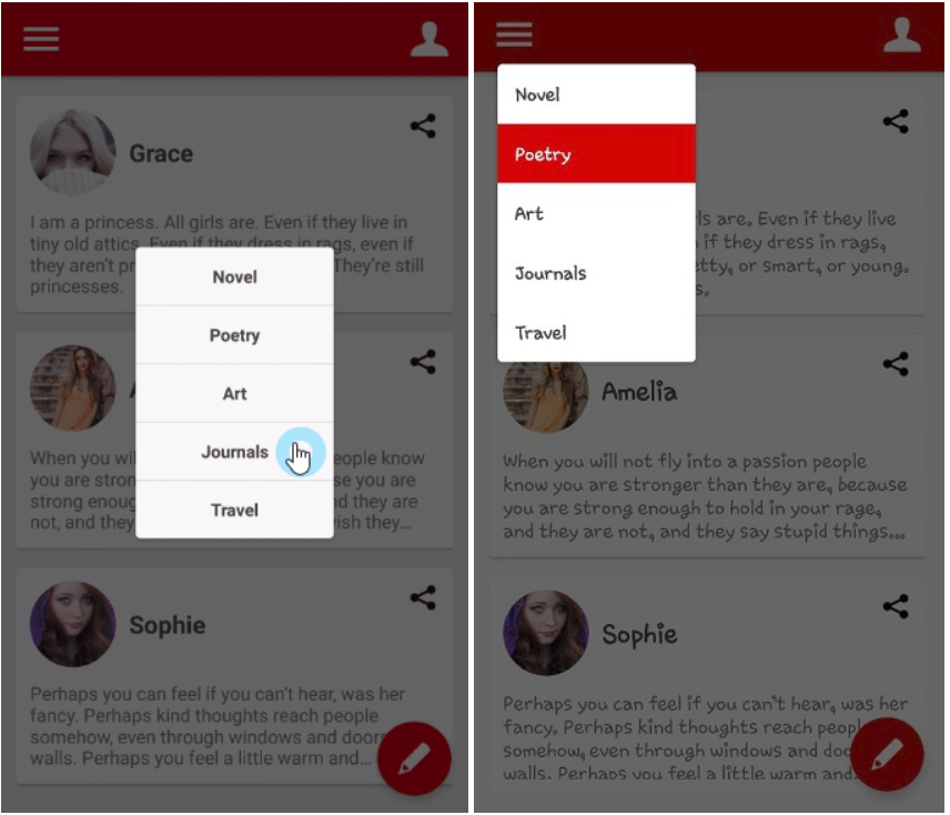
This is a basic example on a screenshot. You can build PowerMenu(Android Popup Menu) using Builder.
PowerMenu powerMenu = new PowerMenu.Builder(context)
                .addItemList(list) // list has "Novel", "Poerty", "Art"
                .addItem(new PowerMenuItem("Journals", false))
                .addItem(new PowerMenuItem("Travel", false))
                .setAnimation(MenuAnimation.SHOWUP_TOP_LEFT) // Animation start point (TOP | LEFT)
                .setMenuRadius(10f)
                .setMenuShadow(10f)
                .setTextColor(context.getResources().getColor(R.color.md_grey_800))
                .setSelectedTextColor(Color.WHITE)
                .setMenuColor(Color.WHITE)
                .setSelectedMenuColor(context.getResources().getColor(R.color.colorPrimary))
                .setOnMenuItemClickListener(onMenuItemClickListener)
                .build();
You can add items or item List using PowerMenuItem class. This is how to initialize PowerMenuItem.
PowerMenuItem powerMenuItem = new PowerMenuItem("Travel", true);
At first, argument is item Title, and the other is setting selected status. If true, the item’s text or background colour is changed by your settings like below:
.setSelectedTextColor(Color.WHITE)
.setSelectedMenuColor(context.getResources().getColor(R.color.colorPrimary))
You can listen to item click.
private  OnMenuItemClickListener<PowerMenuItem> onMenuItemClickListener = new OnMenuItemClickListener<PowerMenuItem>() {
        @Override
        public void onItemClick(int position, PowerMenuItem item) {
            Toast.makeText(getBaseContext(), item.getTitle(), Toast.LENGTH_SHORT).show();
            powerMenu.setSelected(position); // change selected item
            powerMenu.dismiss();
        }
    };
and the last, show popup
powerMenu.showAsDropDown(view); // view is an anchor
or
powerMenu.showAsDropDown(view, (int)xOffset, (int)yOffset);
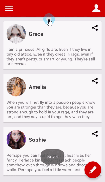
Customizing Android Popup Menu
You can customizing item styles using CustomPowerMenu and your customized adapter.
Below is how to customizing popup item that has an icon.
At first, you should create your item model.
public class IconPowerMenuItem {
    private Drawable icon;
    private String title;

    public IconPowerMenuItem(Drawable icon, String title) {
        this.icon = icon;
        this.title = title;
    }
 // --- skipped setter and getter methods
}
And next, you should create your own customized XML layout and adapter. Custom Adapter should extend MenuBaseAdapter<YOUR_ITEM_MODEL>.
public class IconMenuAdapter extends MenuBaseAdapter<IconPowerMenuItem> {

    @Override
    public View getView(int index, View view, ViewGroup viewGroup) {
        final Context context = viewGroup.getContext();

        if(view == null) {
            LayoutInflater inflater = (LayoutInflater) context.getSystemService(Context.LAYOUT_INFLATER_SERVICE);
            view = inflater.inflate(R.layout.item_icon_menu, viewGroup, false);
        }

        IconPowerMenuItem item = (IconPowerMenuItem) getItem(index);
        final ImageView icon = view.findViewById(R.id.item_icon);
        icon.setImageDrawable(item.getIcon());
        final TextView title = view.findViewById(R.id.item_title);
        title.setText(item.getTitle());
        return view;
    }
}
and the last, build CustomPowerMenu.
CustomPowerMenu customPowerMenu = new CustomPowerMenu.Builder<>(context, new IconMenuAdapter())
                .addItem(new IconPowerMenuItem(context.getResources().getDrawable(R.drawable.ic_wechat), "WeChat"))
                .addItem(new IconPowerMenuItem(context.getResources().getDrawable(R.drawable.ic_facebook), "Facebook"))
                .addItem(new IconPowerMenuItem(context.getResources().getDrawable(R.drawable.ic_twitter), "Twitter"))
                .addItem(new IconPowerMenuItem(context.getResources().getDrawable(R.drawable.ic_line), "Line"))
                .setOnMenuItemClickListener(onMenuItemClickListener)
                .setAnimation(MenuAnimation.SHOWUP_TOP_RIGHT)
                .setMenuRadius(10f)
                .setMenuShadow(10f)
                .build();
You can add a onMenuItemClickListener like below.
private OnMenuItemClickListener<IconPowerMenuItem> onIconMenuItemClickListener = new OnMenuItemClickListener<IconPowerMenuItem>() {
        @Override
        public void onItemClick(int position, IconPowerMenuItem item) {
            Toast.makeText(getBaseContext(), item.getTitle(), Toast.LENGTH_SHORT).show();
            iconMenu.dismiss();
        }
    };
Dialogs
You can create dialogs using PowerMenu.
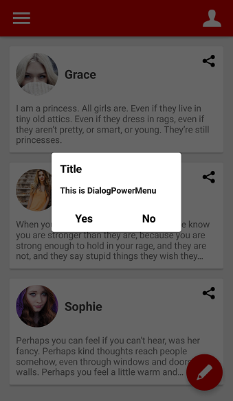
Below example is normal dialog. dialogs are be composed of header, footer and body.
PowerMenu powerMenu = new PowerMenu.Builder(context)
                .setHeaderView(R.layout.layout_dialog_header) // header used for title
                .setFooterView(R.layout.layout_dialog_footer) // footer used for yes and no buttons
                .addItem(new PowerMenuItem("This is DialogPowerMenu", false)) // this is body
                .setLifecycleOwner(lifecycleOwner)
                .setAnimation(MenuAnimation.SHOW_UP_CENTER)
                .setMenuRadius(10f)
                .setMenuShadow(10f)
                .setWith(600)
                .setSelectedEffect(false)
                .build();
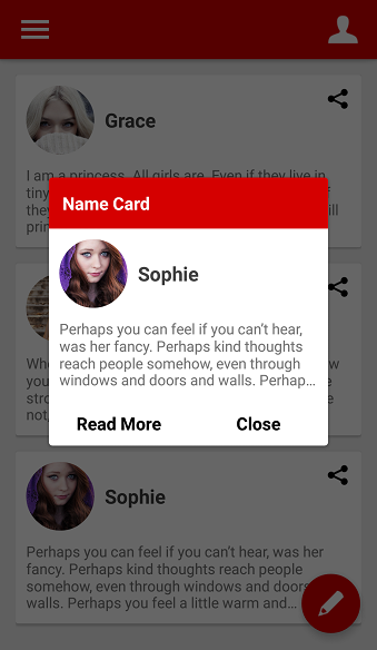
And you can customizing dialog like below.
CustomPowerMenu customPowerMenu = new CustomPowerMenu.Builder<>(context, new CustomDialogMenuAdapter())
                .setHeaderView(R.layout.layout_custom_dialog_header) // header used for title
                .setFooterView(R.layout.layout_custom_dialog_footer) // footer uesd for Read More and Close buttons
                 // this is body
                .addItem(new NameCardMenuItem(context.getResources().getDrawable(R.drawable.face3), "Sophie", context.getString(R.string.board3)))
                .setLifecycleOwner(lifecycleOwner)
                .setAnimation(MenuAnimation.SHOW_UP_CENTER)
                .setWith(800)
                .setMenuRadius(10f)
                .setMenuShadow(10f)
                .build();
Functions
Popup & Item Attrubutes
.addItemList(list)
.addItem(new PowerMenuItem("Journals", false)) // add an PowerMenuItem
.addItem(3, new PowerMenuItem("Travel", false)) // add an PowerMenuItem at position 3
.setLifecycleOwner(lifecycleOwner) // set powermenu's LifecycleOwner what activity or fragment. This make avoid memory leak.
.setWith(300) // set popup width size
.setHeight(400) // set popup height size
.setMenuRadius(10f) // set popup corner radius
.setMenuShadow(10f) // set popup shadow
.setDivider(new ColorDrawable(context.getResources().getColor(R.color.md_blue_grey_300))) // set a divider
.setDividerHeight(1) // set divider's height
.setAnimation(MenuAnimation.FADE) // set Animation
.setTextColor(context.getResources().getColor(R.color.md_grey_800)) // set normoal item text color
.setSelectedTextColor(Color.WHITE) // set selected item text color
.setMenuColor(Color.WHITE) // set normoal item background color
.setSelectedMenuColor(context.getResources().getColor(R.color.colorPrimary)) // set selected item background color
.setSelectedEffect(false) // if false, no apply selected colors(text, background)
.setOnMenuItemClickListener(onMenuItemClickListener) // add a item click listener
.setHeaderView(int layout) // set a fixed view to appear at the top of the list
.setHeaderView(View view) // set a fixed view to appear at the top of the list
.setFooterView(View v) // set a fixed view to appear at the bottom of the list
.setFooterView(View view) // set a fixed view to appear at the bottom of the list
.setSelection(int position) // scroll to position
.getHeaderView() // get header view
.getFooterView() // get footer view
.getMenuListView() // return menu ListView on Powermenu
Background Attrubutes
.setBackgroundAlpha(0.7f) // set background's alpha
.setBackgroundColor(Color.GRAY) // set background's color
.setShowBackground(false) // set showing background
.setOnBackgroundClickListener(onClickListener) // set a background click listener. default is dismiss popup.
Show & Dismiss
.showAsDropDown(view); // show popup with drop-down at anchor view
.showAsDropDown(view, -370, 0); // showAsDropDown with moves (xoff, yoff)
.showAtCenter(layout); // show popup at anchor view's center
.showAtCenter(layout, 0, 0); // showAtCenter with moves (xoff, yoff)
.isShowing(); return true or false
.dismiss(); // dismiss popup
Avoid Memory leak
Dialog, PopupWindow and etc.. have memory leak issue if not dismissed before activity or fragment are destroyed.
But Lifecycles are now also integrated with the Support Library since Architecture Components 1.0 Stable released.
So you can solve memory leak issue so easily.
First, implement LifecycleOwner on your activity or fragment.
public class MainActivity extends AppCompatActivity implements LifecycleOwner
The last, just use setLifecycleOwner method before show.
.setLifecycleOwner(lifecycleOwner)
That’s it !! Hope you enjoy this article please share with your friends.
 Nuur Hasan
 Tell Me How
Share your thoughts