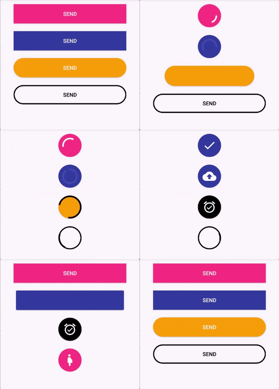
Most of time we need to keep busy the user when they perform button click and working in background process in Android. So we use Progress bar or dialog but here you can use progress button Android library which is an Android Button that morphs into a loading progress bar.
Features of this cool library
- Fully customizable in the XML
- Really simple to use.
- Makes your app looks cooler =D
How to implement Progress Button Android Library
Installation
compile 'br.com.simplepass:loading-button-android:1.6.5'
How to use Progress Button Android Library
Animate and revert animation
Add the button in your layout file and customize it the way you like it.
<br.com.simplepass.loading_button_lib.customViews.CircularProgressButton
   	    android:id="@+id/btn_id"
   	    android:layout_width="match_parent"
           android:layout_height="wrap_content"
           android:background="@drawable/circular_border_shape"
           app:spinning_bar_width="4dp" <!-- Optional -->
           app:spinning_bar_color="#FFF" <!-- Optional -->
           app:spinning_bar_padding="6dp" <!-- Optional -->
Then, instantiate the button
CircularProgressButton btn = (CircularProgressButton) findViewById(R.id.btn_id)

    btn.startAnimation();

[do some async task. When it finishes]
//You can choose the color and the image after the loading is finished
  btn.doneLoagingAnimation(fillColor, bitmap);
  [or just revert de animation]
  btn.revertAnimation();
Show ‘done’ animation
When the loading animation is running, call:
//Choose the color and the image that will be show
circularProgressButton.doneLoagingAnimation(fillColor, bitmap);
Revert the loading animation with different text or image
circularProgressButton.revertAnimation(new OnAnimationEndListener() {
                @Override
                public void onAnimationEnd() {
                    circularProgressButton.setText("Seu texto aqui!");
                }
            });
or
circularProgressImageButton.revertAnimation(new OnAnimationEndListener() {
        @Override
        public void onAnimationEnd() {
            progressButton.setImageDrawable(R.drawable.image);
        }
    });
Configure XML
- app:spinning_bar_width : Changes the width of the spinning bar inside the button
- app:spinning_bar_color: Changes the color of the spinning bar inside the button
- app:spinning_bar_padding: Changes the padding of the spinning bar in relation of the button bounds.
- app:initialCornerAngle: The initial corner angle of the animation. Insert 0 if you have a square button.
- app:finalCornerAngle: The final corner angle of the animation.
Be creative!
You can do a lot of fun stuff with this lib. Check this example:
You can find the code for the animation inside this repo.
This Progress Button Android library is inspired by :
Hope you like this library then please comment us on comment section.

Share your thoughts