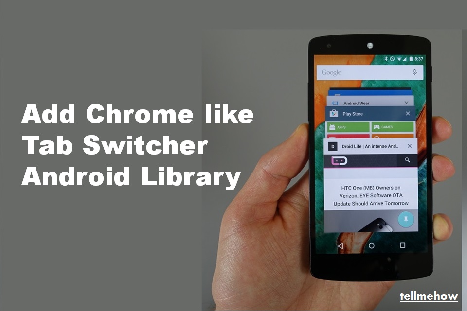
We’re all fascinated to see Tab Switcher in Android browser like Google Chrome, Opera or UC Browser and want to add that Chrome like Tab Switcher in Android. Then ChromeLikeTabSwitcher Android library is for you.
It is an Android-library, which provides a tab switcher similar to the one, which is used in the Android version of Google’s Chrome browser. It provides layouts optimized for smartphone and tablet devices.
The following GIFs(demo) illustrate the appearance of the library:

The library provides the following features:
- Provides layouts optimized for smartphones and tablets.
- Tabs can dynamically be added and removed either programmatically or by using the UI. Different types of animations are available for said purpose.
- The tab switcher’s state is automatically restored on configuration changes.
- In order to provide great performance, views are automatically recycled and the previews of tabs are rendered as bitmaps.
- The apperance of tabs, e.g. their background or title color, can be customized.
Note : THIS LIBRARY IS STILL WORK IN PROGRESS. THE LAYOUT OPTIMIZED FOR TABLETS IS NOT IMPLEMENTED YET.
How to implement Chrome like Tab Switcher Android Library
This library can be added to your Android app as a Gradle dependency by adding the following to the respective module’s build.gradle file:
dependencies {
    compile 'com.github.michael-rapp:chrome-like-tab-switcher:0.1.0'
}
The library’s tab switcher is implemented as a custom view TabSwitcher. It can be added to an activity or fragment by being declared programmatically or via a XML resource. The following XML code shows how the view can be added to a XML layout resource. A tab switcher should typically be shown fullscreen by setting the attributes layout_width and layout_height to match_parent.
Furthermore, the view provides various custom attributes for customizing its appearance, which can as well be seen in the given example.
<?xml version="1.0" encoding="utf-8"?>
<de.mrapp.android.tabswitcher.TabSwitcher
        android:id="@+id/tab_switcher"
        xmlns:android="http://schemas.android.com/apk/res/android"
        xmlns:custom="http://schemas.android.com/apk/res-auto"
        android:layout_width="match_parent"
        android:layout_height="match_parent"
        android:background="@color/tab_switcher_background_color"
        custom:layoutPolicy="auto"
        custom:tabIcon="@drawable/ic_file_outline_18dp"
        custom:tabBackgroundColor="@color/tab_background_color"
        custom:tabTitleTextColor="@color/tab_title_text_color"
        custom:tabCloseButtonIcon="@ic_close_18dp"
        custom:toolbarTitle="@string/tab_switcher_toolbar_title"
        custom:toolbarMenu="@menu/tab_switcher_toolbar_menu"
        custom:toolbarNavigationIcon="@drawable/ic_add_box_white_24dp"/>
When instantiating a TabSwitcher programmatically, the following Java code can be used. For all XML attributes shown in the example above, corresponding setter methods are available.
TabSwitcher tabSwitcher = new TabSwitcher(context);
tabSwitcher.setBackground(ContextCompat.getColor(context, R.color.tab_switcher_background_color);
tabSwitcher.setLayoutPolicy(LayoutPolicy.AUTO);
tabSwitcher.setTabIcon(R.drawable.ic_file_outline_18dp);
tabSwitcher.setTabBackgroundColor(ContextCompat.getColor(context, R.color.tab_background_color);
tabSwitcher.setTabTitleTextColor(ContextCompat.getColor(context, R.color.tab_title_text_color);
tabSwitcher.setTabCloseButtonIcon(R.drawable.ic_close_18dp);
tabSwitcher.setToolbarTitle(context.getString(R.string.tab_switcher_toolbar_title));
tabSwitcher.inflateToolbarMenu(R.menu.tab_switcher_toolbar_menu, null);
tabSwitcher.setToolbarNavigationIcon(R.drawable.ic_add_box_white_24dp, null);
The tabs, which are contained by a TabSwitcher are represented by instances of the class Tab. The following Java code demonstrates, how a new tab can be created and added to a tab switcher. By setting a custom icon, background color, title color etc., the defaults, which are applied to the TabSwitcher can be overridden for that particular tab. The setParameters-method allows to associate a tab with a Bundle, which may contain additional information about the tab. By implementing the interface Tab.Callback and registering an instance at a Tab by using its addCallback-method, it can be observed, when the properties of a tab has been changed.
Tab tab = new Tab("Title");
tab.setCloseable(true);
tab.setIcon(R.drawable.ic_file_outline_18dp);
tab.setBackgroundColor(ContextCompat.getColor(context, R.color.tab_background_color));
tab.setTitleTextColor(ContextCompat.getColor(context, R.color.tab_title_text_color));
tab.setParameters(new Bundle());
tab.addCallback(new Tab.Callback() { /* ... */ });
tabSwitcher.addTab(tab);
In order to specify how the tabs of a TabSwitcher should look like, the abstract class TabSwitcherDecorator must be overridden and an instance of the implementing class must be applied to the tab switcher by using its setDecorator-method. This is very similar to the paradigm of adapters commonly used in Android developing for populating a ListView, RecyclerView, etc. Each custom implementation of the class TabSwitcherDecorator must override the onInflateView– and onShowTab-method. The first one is used to inflate the view, which should be used by a tab, the latter allows to customize the appearance of the inflated view, depending on the current state. Within the scope of the onShowTab-method the decorator’s findViewById-method can be used to reference views. It uses a built-in view holder for better performance.
If different views should be inflated for different tabs, the getViewTypeCount– and getViewType-methods must be overridden as well. The first one should return the total number of different views, which are inflated by the onInflateView-method, the latter one must return a distinct integer value, which specifies the view type of a specific tab. The following code illustrates how the class TabSwitcherDecoratorcan be implemented.
Furthermore, the class TabSwitcherDecorator enables to override the onSaveInstanceState-method in order to store the current state of a tab within a Bundle. When the tab is shown again, the Bundle will be passed to the onShowTab-method in order to be able to restore the previously saved state.
class Decorator extends TabSwitcherDecorator {

    @NonNull
    @Override
    public View onInflateView(@NonNull LayoutInflater inflater,
                              @Nullable ViewGroup parent, int viewType) {
        if (viewType == 0) {
            return inflater.inflate(R.layout.tab_view_1, parent, false);
        } else {
            return inflater.inflate(R.layout.tab_view_2, parent, false);
        }
    }

    @Override
    public void onShowTab(@NonNull Context context, @NonNull TabSwitcher tabSwitcher,
                          @NonNull View view, @NonNull Tab tab, int index, int viewType,
                          @Nullable Bundle savedInstanceState) {
        if (viewType == 0) {
            TextView textView = findViewById(R.id.text_view);
            textView.setText(tab.getTitle());
        } else {
            Button button = findViewById(R.id.button);
            button.setText(tab.getTitle());
        }

        if (savedInstanceState != null) {
            // Restore the tab's state if necessary
        }
    }

    @Override
    public int getViewTypeCount() {
        return 2;
    }

    @Override
    public int getViewType(@NonNull Tab tab, int index) {
        Bundle parameters = tab.getParameters();
        return parameters != null ? parameters.getInt("view_type") : 0;
    }

    @Override
    public void onSaveInstanceState(@NonNull View view, @NonNull Tab tab, int index,
                                    int viewType, @NonNull Bundle outState) {
        // Store the tab's current state in the Bundle outState if necessary
    }

}
In order to apply a decorator to a TabSwitcher its setDecorator-method must be used as shown below. If no decorator has been set, an IllegalStateException will be thrown as soon as the view should become visible.
tabSwitcher.setDecorator(new Decorator());
In order to observe the state of a TabSwitcher, the interface TabSwitcherListener listener can be implemented. The interface provides methods, which are invoked, when tabs are added to or removed from a tab switcher, or if the tab switcher has been hidden or shown (only when using the smartphone layout). Instances of the type TabSwitcherListener can be added by using a TabSwitcher‘s addListener-method. In order to observe, when the close button of a tab has been clicked, the interface TabCloseListener can be implemented and added by using the addTabCloseListener-method accordingly.
How to Use Animation in Tab Switcher Library
The class TabSwitcher provides various methods to add or remove one or several tabs. If the tab switcher is currently shown, tabs are added or removed in an animated manner. In order to use custom animations, an instance of the class Animation can be passed to the methods.
Swipe Animation
When using the smartphone layout, a SwipeAnimation is used to add or remove tabs by default. It causes tabs to be swiped horizontally (or vertically in landscape mode). By specifying a value of the enum SwipeAnimation.SwipeDirection, it can be specified, whether the tab should be moved to/from the left or right (respectively to/from the top or bottom in landscape mode). The following code sample illustrates how instances of the class SwipeAnimation can be created by using a builder.
Animation animation = new SwipeAnimation.Builder().setDuration(2000)
        .setInterpolator(new LinearInterpolator()).setDirection(SwipeAnimation.SwipeDirection.LEFT)
        .create();

Reveal Animation
When using the smartphone layout, a RevealAnimation can be used to add a single tab. Starting at a specific position, the size of the tab will be animated until it is shown fullscreen. Using a RevealAnimation causes the tab switcher to become hidden and the added tab is selected automatically. The following code shows, how a RevealAnimation can be instantiated. All of the builder’s setter methods are optional. If they are not called, default values are used.
Animation animation = new RevealAnimation.Builder().setDuration(2000)
        .setInterpolator(new LinearInterpolator().setX(20).setY(50)
        .create();

PeekAnimation
A RevealAnimation can be used to add a tab, if the smartphone layout is used and when the switcher is currently not shown. Similar to a RevealAnimation, the size of the added tab is animated, starting at a specific position. The tab is then shown at the bottom (or right in landscape mode) of the tab switcher for a short time. Unlike a RevealAnimation, a PeekAnimation does not cause the added tab to become selected. Its purpose is to give a preview of the added tab, while another tab is still shown fullscreen. This corresponds to the animation, which is used in the Google Chrome browser when opening a link in a new tab. A PeekAnimation can be created by using the builder pattern as shown below.
Animation animation = new PeekAnimation.Builder().setDuration(2000)
        .setInterpolator(new LinearInterpolator().setX(20).setY(50)
        .create();

Toolbars and Menus
The view TabSwitcher, which is provided by the library, allows to show a toolbar. By default, the toolbar is always hidden. In order to show it, the showToolbars-method must be used. When using the smartphone layout, the toolbar is shown when the tab switcher is currently shown, or if no tabs are contained by the tab switcher. When using the tablet layout, two toolbars – one to the left and one to the right of the tabs – are always shown. The toolbars can be referenced by using the getToolbars-method. It returns an array, which contains the layout’s toolbars. When using the smartphone layout, only one Toolbar is contained by the array, when using the tablet layout, the left one is contained at index 0 and the right one is contained at index 1.
The class TabSwitcher provides a few methods, which allow to set the toolbar’s title, navigation icon and menu. The setToolbarTitle-method allows to set a title. When using the tablet layout, the title is applied to the left toolbar. The setToolbarNavigationIcon-method allows to specify the navigation icon of the toolbar as well as a listener which is invoked when the icon is clicked. When using the tablet layout, the navigation icon is applied to the left toolbar. In order to add a menu to a TabSwitcher‘s toolbar, the inflateToolbarMenu-method can be used. Besides the resource id of the menu resource, which should be applied, it also allows to specify a listener, which is notified when a menu item is clicked.
In order to provide a button, similar to the one, which is used in Google’s Chrome browser, which shows the total number of tabs contained by a TabSwitcher and allows to toggle the visibility of the tab switcher, the class TabSwitcherButton is exposed by the library. It implements a custom ImageButton, which implements the interface TabSwitcherListener in order to keep the displayed number of tabs up-to-date. The appearance of the button is given by the class TabSwitcherDrawable. If a TabSwitcherButton should be used as part of a toolbar menu, it must be included in a menu resource as shown in the following XML code.
<menu xmlns:android="http://schemas.android.com/apk/res/android"
      xmlns:app="http://schemas.android.com/apk/res-auto">

    <item
        android:id="@+id/toggle_tab_switcher_menu_item"
        android:title="@string/toggle_tab_switcher_menu_item"
        app:actionLayout="@layout/tab_switcher_menu_item"
        app:showAsAction="ifRoom"/>

</menu>
In order to register a menu’s TabSwitcherButton as a listener of a TabSwitcher, the static setupWithMenu-method can be used. It automatically registers all items of a Menu, that use a TabSwitcherButton, as listeners of a specific TabSwitcher. The OnClickListener, which can optionally be specified, is invoked when one of these buttons is clicked. The following code shows, how the method can be used together with the toolbar menu of a TabSwitcher. However, it also works with arbitrary menus.
tabSwitcher.addOnGlobalLayoutListener(new OnGlobalLayoutListener() {

    @Override
    public void onGlobalLayout() {
        Menu menu = tabSwitcher.getToolbarMenu();
        TabSwitcher.setupWithMenu(tabSwitcher, menu, new OnClickListener() { /* ... */ });
    }

});
Padding
The view TabSwitcher overrides the setPadding-methods of the class View in order to apply the padding to all tabs as well as to their parent view. The main purpose of this behavior is to apply window insets, when using a translucent status and/or navigation bar as it can be seen in the library’s example app. The following code sample demonstrates, how the window insets of an activity can be applied to a tab switcher by using a OnApplyWIndowInsetsListener. It is meant to be used in the activity’s onCreate-method.
ViewCompat.setOnApplyWindowInsetsListener(tabSwitcher, new OnApplyWIndowInsetsListener() {

    @Override
    public WindowInsetsCompat onApplyWindowInsets(View v, WindowInsetsCompat insets) {
        tabSwitcher.setPadding(insets.getSystemWindowInsetsLeft(),
                insets.getSystemWindowInsetsTop(),
                insets.getSystemWindowInsetsRight(),
                insets.getSystemWindowInsetsBottom());
        return insets;
    }

});
Hope you like this tutorial and please comment us with your suggestion and thoughts.
 Nuur Hasan
I’m new at this and it is a little overwhelming right now. I’ve actually coded before but not for a long time and with a different language / interpreter.
I appreciate the way your site has laid out the steps and explanations.
Thanks. ??