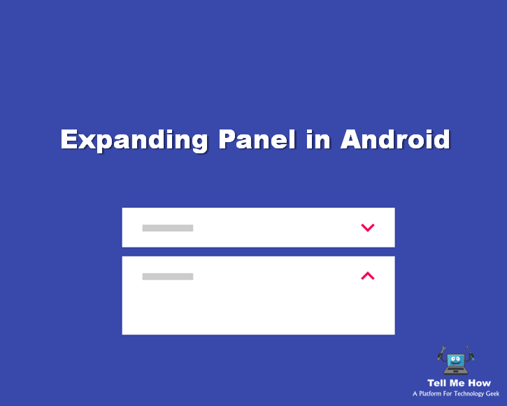
Previously we discuss about Expansion Collection Android Library which is a card peek/pop controller. But today we’ll see about expanding panel which is an expansion panel is a lightweight container that may either stand alone or be connected to a larger surface, such as a card.
Use of Expanding Panel in Android
Editing
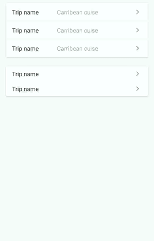
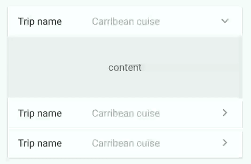
Expansion panels are best used for lightweight editing of an element, such as selecting a value for a setting.
For example, an app that contains tables may use expansion panels to adjust settings on table elements.
Creation flows
Expansion panels may be displayed in a sequence to form creation flows.
For example, a tool for creating ad campaigns may display a series of expansion panels to collect campaign details.
Lets find out how you can implement Expanding Panel in your application:
It contain creation flows and allow lightweight editing of an element. Based on Expansion Panels described on Material Design Components.
Import this Expanding Panel library in your project
dependencies {
    compile 'com.github.florent37:expansionpanel:1.0.3'
}
Usage
<LinearLayout
    android:layout_height="wrap_content"
    android:layout_width="match_parent"
    android:orientation="vertical"
    >

    <com.github.florent37.expansionpanel.ExpansionHeader
        android:layout_height="wrap_content"
        android:layout_width="match_parent"
        app:expansion_headerIndicator="@id/headerIndicator"
        app:expansion_layout="@id/expansionLayout"
        app:expansion_toggleOnClick="true">

        <!-- HEADER -->

        ...
        <!-- HEADER INDICATOR -->
        <android.support.v7.widget.AppCompatImageView
               android:adjustViewBounds="true"
               android:id="@+id/headerIndicator"
               android:layout_alignParentRight="true"
               android:layout_centerVertical="true"
               android:layout_height="wrap_content"
               android:layout_marginLeft="16dp"
               android:layout_width="wrap_content"
               app:srcCompat="@drawable/ic_expansion_header_indicator_grey_24dp" />


    </com.github.florent37.expansionpanel.ExpansionHeader>

    <com.github.florent37.expansionpanel.ExpansionLayout
        android:id="@+id/expansionLayout"
        android:layout_height="wrap_content"
        android:layout_width="match_parent">

        <!-- CONTENT -->

    </com.github.florent37.expansionpanel.ExpansionLayout>
</LinearLayout>
Header
- Connect with his Expansion Layout :
expansion_layout(they must have the same parent) - Define the indicator view with
expansion_headerIndicator(the id of a view inside the header) - If you want to expand/close when the header is clicked, setup
expansion_toggleOnClick - You can modify the indicator rotation with
expansion_headerIndicatorRotationExpandedandexpansion_headerIndicatorRotationCollapsed.
Layout
You can modify the default expansion of the label with `app:expansion_expanded=”false”
Layout can be toggled programmatically with .toggle()
Use .setEnable(true/false) to enable/disable the expansion.
Open only one
You can setup multiple expansions layout to enable only 1 opened at time.
final ExpansionLayoutCollection expansionLayoutCollection = new ExpansionLayoutCollection();
expansionLayoutCollection.add(ex1);
expansionLayoutCollection.add(ex2);

expansionLayoutCollection.openOnlyOne(true);
or direcly in xml with
- ExpansionsViewGroupLinearLayout
- ExpansionsViewGroupFrameLayout
- ExpansionsViewGroupRelativeLayout
- ExpansionsViewGroupConstraintLayout
<com.github.florent37.expansionpanel.viewgroup.ExpansionsViewGroupLinearLayout
                android:layout_width="match_parent"
                android:layout_height="wrap_content"
                app:expansion_openOnlyOne="true"
                android:orientation="vertical">

                <!-- Expansions Header & Layouts -->

</com.github.florent37.expansionpanel.viewgroup.ExpansionsViewGroupLinearLayout>
Hope you enjoy this tutorial !! If answer is yes then please share with your friends.
 Neha Nidhi
Share your thoughts