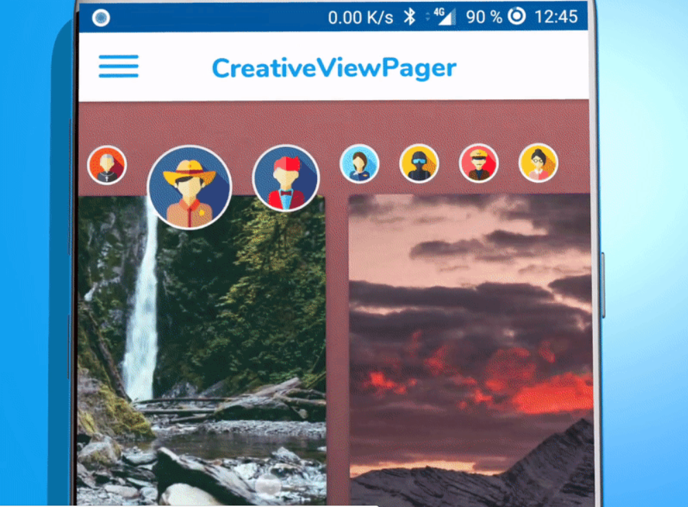
Creative View Pager easy to use ! This view pager library combines a header list which is scrolling automatically in coordination with the page contents.
We already discuss some Creative View Pager animation library like :
- Infinite Cycle ViewPager
- HollyViewPager – Android Navigation
- Parallax ViewPager
- ViewPager cards animation
- DiscreteScrollView
But today i am going to show an animation library that looks like the top bubbles scrolling with the pages content. See the demo :

Let move to implementation part of Creative View Pager Android Library:
Download
dependencies {
    implementation 'com.tbuonomo:creative-viewpager:1.0.1'
}
or
In your XML layout
Add CreativeViewPager in your activity’s layout
<com.tbuonomo.creativeviewpager.CreativeViewPager
    android:id="@+id/creativeViewPagerView"
    android:layout_width="match_parent"
    android:layout_height="match_parent"
    app:contentHorizontalPadding="32dp"
    app:contentMargin="8dp"
    app:imagesMargin="8dp"
    app:imagesSize="92dp"
    />
You will see a fake preview in Android Studio of the creative view.
Custom XML Attributes
| Attribute | Description |
|---|---|
contentHorizontalPadding |
The start and end padding in dp of the content pages relative to the parent layout (by default 32dp) |
contentItemMargin |
Margin in dp of each content item (by default 8dp) |
headerItemMargin |
Margin in dp of each header item (by default 8dp) |
headerItemSize |
The size in dp of the header items (by default 92dp) |
Adapter
Create your own adapter extending CreativeViewAdapter
class NatureCreativePagerAdapter(val context: Context) : CreativePagerAdapter
By default, you have to override the 3 methods instantiateHeaderItem, instantiateContentItem and getCount.
override fun instantiateHeaderItem(inflater: LayoutInflater, container: ViewGroup, position: Int): View {
    // Inflate page layout
    val headerRoot = inflater.inflate(R.layout.item_creative_content_nature, container, false)

    // Bind the views
    val title: TextView = headerRoot.findViewById(R.id.itemCreativeNatureTitle)
    val image: ImageView = headerRoot.findViewById(R.id.itemCreativeNatureImage)

    title.text = context.getString(R.string.item_nature_title, position)
    image.setImageDrawable(context.getDrawable(NatureItem.values()[position].natureDrawable))

    return headerRoot
  }

  override fun instantiateContentItem(inflater: LayoutInflater, container: ViewGroup, position: Int): View {
    // Inflate the header view layout
    val contentRoot = inflater.inflate(R.layout.item_creative_header_profile, container,
            false)

    // Bind the views
    val imageView = contentRoot.findViewById<ImageView>(R.id.itemCreativeImage)

    imageView.setImageDrawable(ContextCompat.getDrawable(context, NatureItem.values()[position].userDrawable))
    return contentRoot
  }

  override fun getCount(): Int {
    return NatureItem.values().size
  }
If you want to have the cool colored background effect when you’re sliding the view pager, you have to override the two methods and provide the bitmap used for specific position.
override fun isUpdatingBackgroundColor(): Boolean {
    return true
  }

  override fun requestBitmapAtPosition(position: Int): Bitmap? {
    // Return the bitmap used for the position
    return BitmapFactory.decodeResource(context.resources,
            NatureItem.values()[position].natureDrawable)
  }
App demo

In your Activity / Fragment
Finally, set your adapter to the CreativeViewPager in your activity or fragment.
creativeViewPagerView.setCreativeViewPagerAdapter(NatureCreativePagerAdapter(activity))
Don’t forget to star the project if you like it!  ==
== 

Hi @TellMeHow,
Thanks for your interest in my library!
You can check out this other library for displaying cool dots indicators for ViewPager.
Best regards.
Thank you Tommy,
I really appreciate your work and keep it up. Really you made a great UI and help many of developers.
Here the link: https://github.com/tommybuonomo/dotsindicator