Previously we discuss about toolbar animation which was a cool tutorial but today We discuss about SpaceTabLayout animation which is a awesome TabLayout for Android with a central Floating Action Button.
This is a custom implementation of a RelativeLayout that you can use along with a ViewPager to navigate between fragments.
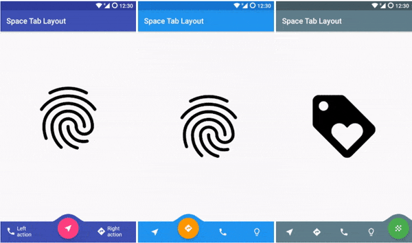
See the demo above:
How to use SpaceTabLayout animation in your application:
You can use this properties in xml for convenience. You can set the number of tabs you want to use and the starting tab position.
app:number_of_tabs="five"
        app:starting_position="three"

        app:tab_color="@color/colorPrimary"
        app:button_color="@color/colorAccent"
        app:text_color="#61FFFFFF"

        app:icon_one="@drawable/ic_hotel_black_24dp"
        app:icon_two="@drawable/design_ic_visibility"
        app:icon_three="@drawable/ic_content_cut_black_24dp"
        app:icon_four="@drawable/ic_check_black_24dp"
        app:icon_five="@drawable/ic_fingerprint_black_24dp"

        app:text_one="Action"
        app:text_two="Action"
        app:text_three="Action"
You can also use the following methods to customize its appearance and behavior:
Set the icon for both the first tab and the Action Button when in the first position.Set the icon for both the second tab and the Action Button when in the second position.
| Method | Description |
|---|---|
| getTabLayout(); | Gives you the base RelativeLayout. |
| setTabColor(@ColorInt int backgroundColor); | Change the color of the Tab. |
| getCurrentPosition(); | Gives you the current tab position. |
| getButton(); | Give you the Floating Action Button View. |
| setButtonColor(@ColorInt int backgroundColor); | Change the color of the Floating Button. |
| setOnClickListener(View.OnClickListener l); | Set the same OnClickListener to all positions. |
| setTabOneOnClickListener(View.OnClickListener ll); | Set the OnClickListener for the first position. |
| setTabTwoOnClickListener(View.OnClickListener cl); | Set the OnClickListener for the second position. |
| getTabOneView(); | Get you the first base LinearLayout that contains an ImageView or an ImageView and a TextView. |
| setTabOneView(View tabOneView); | You can set the base layout for the first position. |
| getTabTwoView(); | Get you the second base LinearLayout that contains an ImageView or an ImageView and a TextView. |
| setTabTwoView(View centerView); | You can set the base layout for the second position. |
| setTabOneIcon(@DrawableRes int tabOneIcon); | Set the icon for both the first tab and the Action Button when in the first position. |
| setTabTwoIcon(@DrawableRes int tabTwoIcon); | Set the icon for both the second tab and the Action Button when in the second position. |
Motivation
I get the inspiration from the Google Space app that uses a center Floating Action Button. I liked the idea so much that I though that it would be so nice if we could have this like a TabLayout.
Did you know? : Android Studio Shortcut key every developer should know
You can see in the image:

Installation
Declaring dependencies
Add this to dependencies brackets in the gradle.build file:
compile 'eu.long1:spacetablayout:1.0.4'
XML implementation
In your layout just include this. You can customize the Tab here with text, icons, colors…
<eu.long1.spacetablayout.SpaceTabLayout
        android:id="@+id/spaceTabLayout"
        android:layout_width="wrap_content"
        android:layout_height="wrap_content"
        app:number_of_tabs="five"
        app:starting_position="three"
        app:tab_color="@color/colorPrimary"
        app:button_color="@color/colorAccent"
        app:text_color="#61FFFFFF"
        app:icon_one="@drawable/ic_hotel_black_24dp"
        app:icon_two="@drawable/design_ic_visibility"
        app:icon_three="@drawable/ic_content_cut_black_24dp"
        app:icon_four="@drawable/ic_check_black_24dp"
        app:icon_five="@drawable/ic_fingerprint_black_24dp"/>
SnackBar behavior
If you are using a CoordinatorLayout as the root of your layout you can add this line to proper handle the behavior when a SnackBar is visible.
app:layout_behavior="eu.long1.spacetablayout.SpaceTabLayoutBehavior"
XML Example
<android.support.design.widget.CoordinatorLayout xmlns:android="http://schemas.android.com/apk/res/android"
    xmlns:app="http://schemas.android.com/apk/res-auto"
    android:id="@+id/activity_main"
    android:layout_width="match_parent"
    android:layout_height="match_parent">

    <android.support.v4.view.ViewPager
        android:id="@+id/viewPager"
        android:layout_width="match_parent"
        android:layout_height="wrap_content"
        android:layout_marginBottom="56dp" />

    <eu.long1.spacetablayout.SpaceTabLayout
        android:id="@+id/spaceTabLayout"
        android:layout_width="wrap_content"
        android:layout_height="wrap_content"
        app:layout_behavior="eu.long1.spacetablayout.SpaceTabLayoutBehavior"
        app:number_of_tabs="five"
        app:starting_position="three" />

</android.support.design.widget.CoordinatorLayout>
Code implementation
In your MainActivity.java you need to initialize the SpaceTabLayout like this:
SpaceTabLayout tabLayout;

        @Override
        protected void onCreate(Bundle savedInstanceState) {
            super.onCreate(savedInstanceState);
            setContentView(R.layout.activity_main);

            //add the fragments you want to display in a List
            List<Fragment> fragmentList = new ArrayList<>();
            fragmentList.add(new FragmentA());
            fragmentList.add(new FragmentB());
            fragmentList.add(new FragmentC());

            ViewPager viewPager = (ViewPager) findViewById(R.id.viewPager);
            tabLayout = (SpaceTabLayout) findViewById(R.id.spaceTabLayout);

            //we need the savedInstanceState to get the position
            tabLayout.initialize(viewPager, getSupportFragmentManager(),
                            fragmentList, savedInstanceState);
        }


        //we need the outState to save the position
        @Override
        protected void onSaveInstanceState(Bundle outState) {
            tabLayout.saveState(outState);
            super.onSaveInstanceState(outState);
        }
Download this library
Hope you like this tutorial on SpaceTabLayout animation.
 Nuur Hasan
Share your thoughts