In most of the application, we need to implement a rating section in our application and if it’ll be animated star rating. Then this Android Library is just for you.
You’ve seen rating bars, right? Maybe while shopping online on Amazon or in other apps. This Android rating bar feature is used to give a rating to apps, games, online products, services, and lots of other stuff. How does this feature help you ask? Well for starters, it allows app users to leave a feedback based on their experience on your Android app. This ultimately helps developers to identify where the app needs to be improved.
It is a star view to set rating in an animated way. If you want to see the demo just see the below image. You can download the source of the demo application in between of the article.
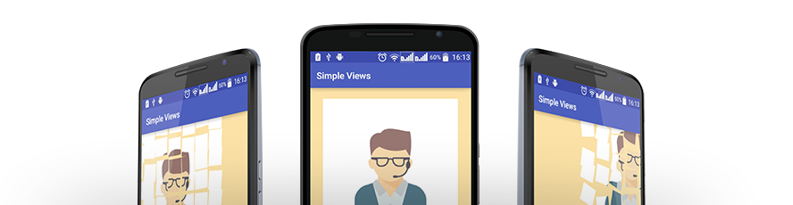
Demo of Animated Star Rating:

Installation
The easiest way to add the library to your project is by adding it as a dependency to your build.gradle
dependencies {
   implementation 'com.neberox.library:animatedstar:0.0.2'
}
Usage
Using XML
<com.neberox.library.animatedstar.StarRatingBar
       xmlns:app="http://schemas.android.com/apk/res-auto"
       android:layout_width="250dp"
       android:layout_height="250dp"
       android:layout_centerInParent="true"
       app:textPadding="0.5"
       />
Create StarRatingBar programmatically
RelativeLayout mainLayout = findViewById(R.id.mainView);

RelativeLayout.LayoutParams params = new RelativeLayout.LayoutParams(400, 400);
params.addRule(CENTER_IN_PARENT);
StarRatingBar bar = new StarRatingBar(this);
mainLayout.addView(bar, params);

bar.setAnimDuration(200); //(Optional)
bar.setFillColor(Color.WHITE); //(Optional)
bar.setSelectedColor(Color.parseColor("#f2b01e")); //(Optional)
bar.setStrokeColor(Color.LTGRAY); //(Optional)
bar.setStrokeWidth(1); //(Optional)
bar.setTextPadding(0.5f); //(Optional)
bar.setTextColor(Color.LTGRAY); //(Optional)
bar.setSelectedTextColor(Color.WHITE); //(Optional)
bar.setTextSize(18); //(Optional)

bar.regenerateStar();  //(Compulsory)
Set ratings programmatically
bar.setRating(3);
Attributes
| Name | Description | Default |
|---|---|---|
| strokeColor(optional) | Stroke outside each corner. Available only for non rated points | LTGRAY |
| strokeWidth(optional) | Size of the outer stroke | 1dp |
| fillColor(optional) | Color of un rated points of star | WHITE |
| selectedColor | Color of the rated points of star | #f2b01e |
| textColor(optional) | Color of the text written on each point of star indicating rating | LTGRAY |
| textPadding(optional) | Determines where the text will be drawn either close to corner (1) or close to middle (0). Range 0->1 | 0.5 |
| textSize(optional) | Text font size | 18sp |
| selectedTextColor(optional) | Color of text drawn over the rated points of star | WHITE |
Download the Animated Star Rating Library
Hope you like the article <3 and this project is much helpful for you then please comment and share with you friends.
 Nuur Hasan
Share your thoughts